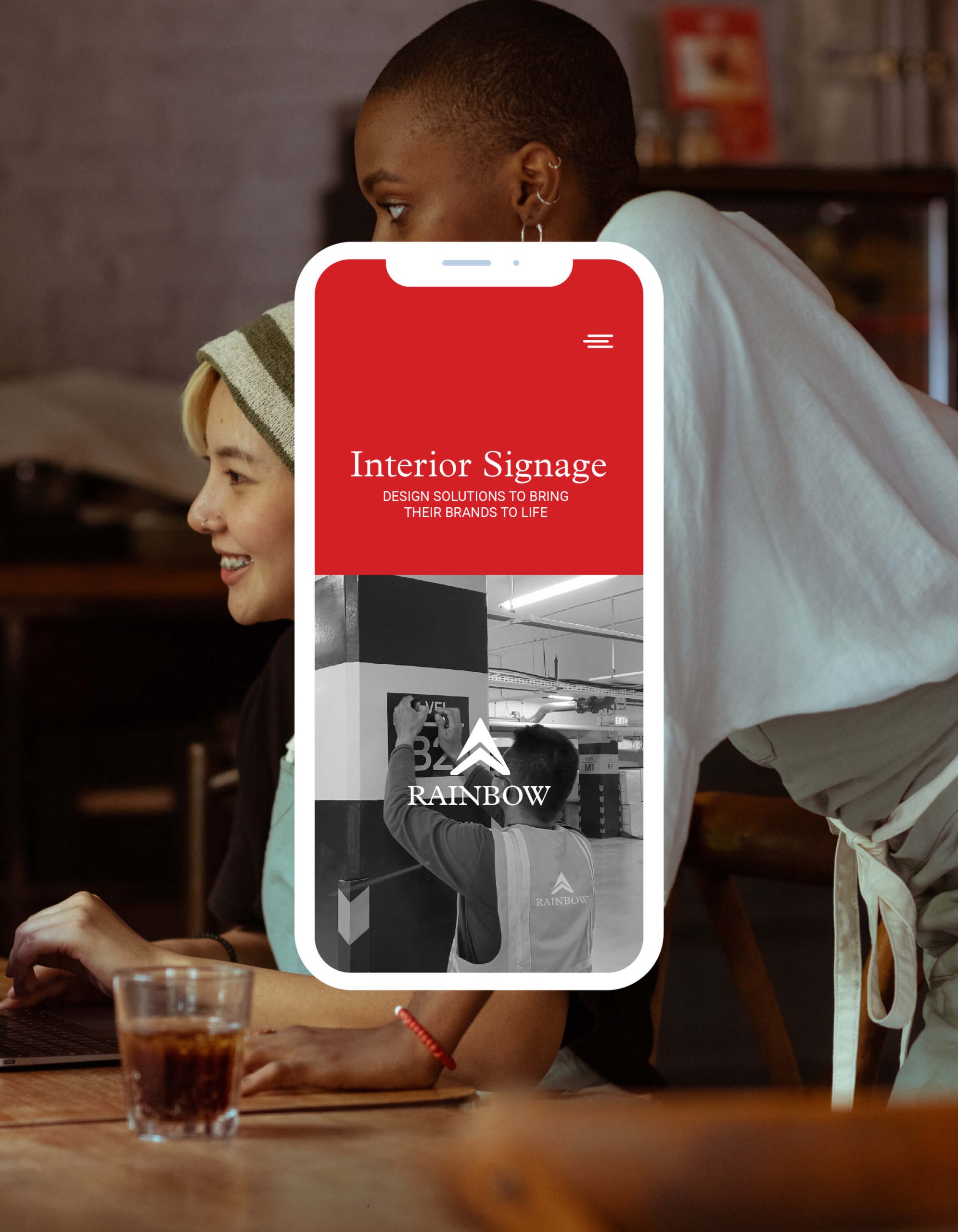
The brand is associated with the rainbow for its symbol of hopes and dreams, just like installing new storefront signage that signals a promising beginning for businesses. The main goal of the project was approach the smaller retail market for its faster market growth. From the philosophy above, the dots were connected to finding the best statement of brand identity. Including the choice of brand colors that combined red, blue, and cool gray elements.
Logo • Brand Identity • Social Media • Photography
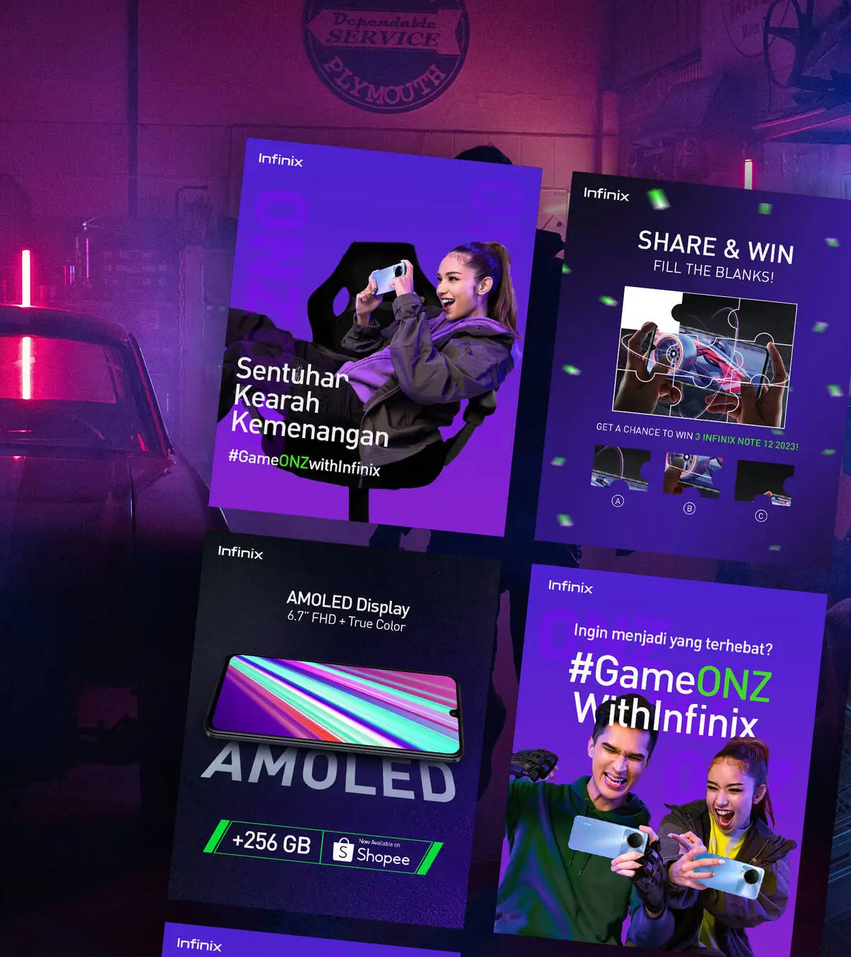
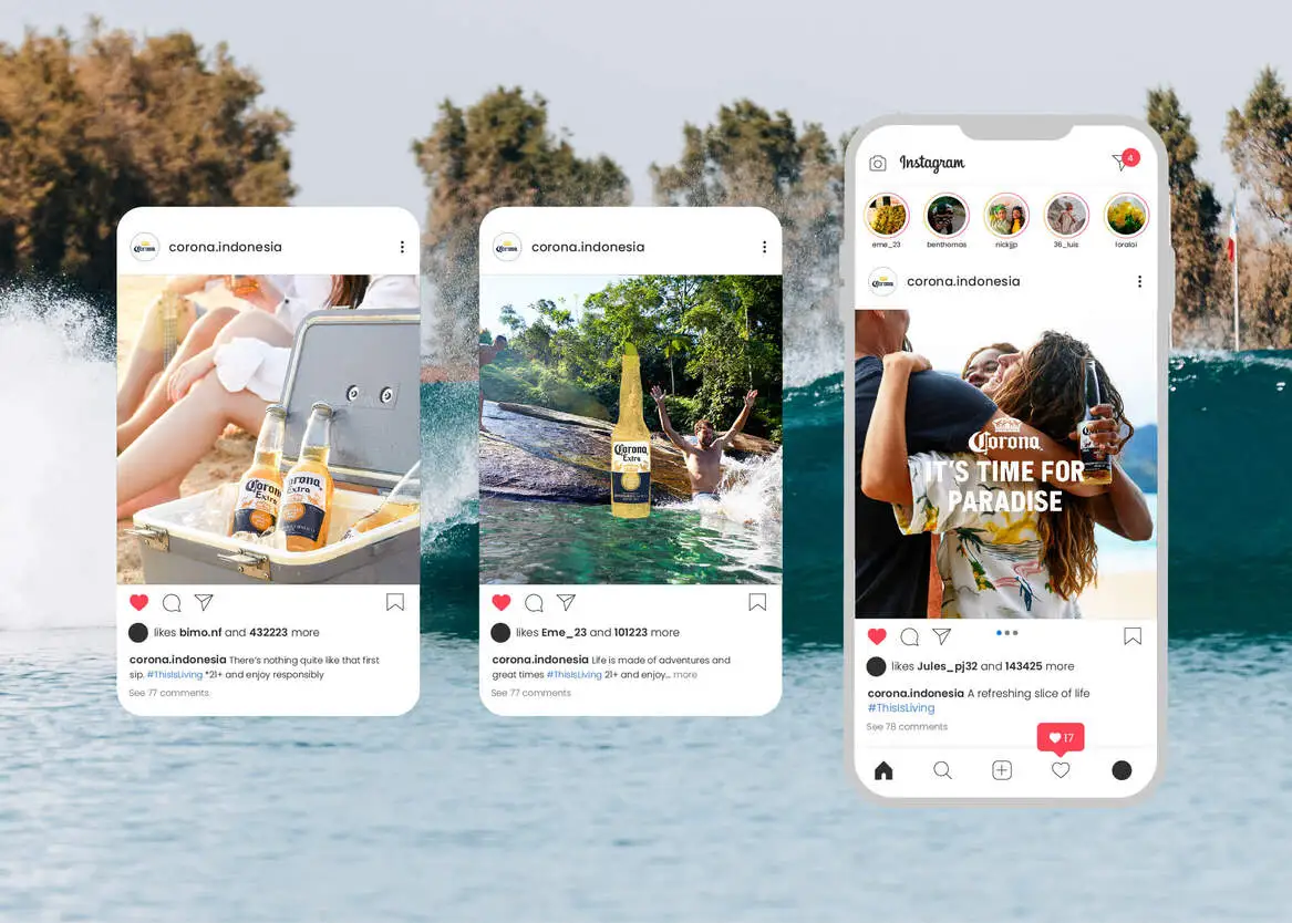
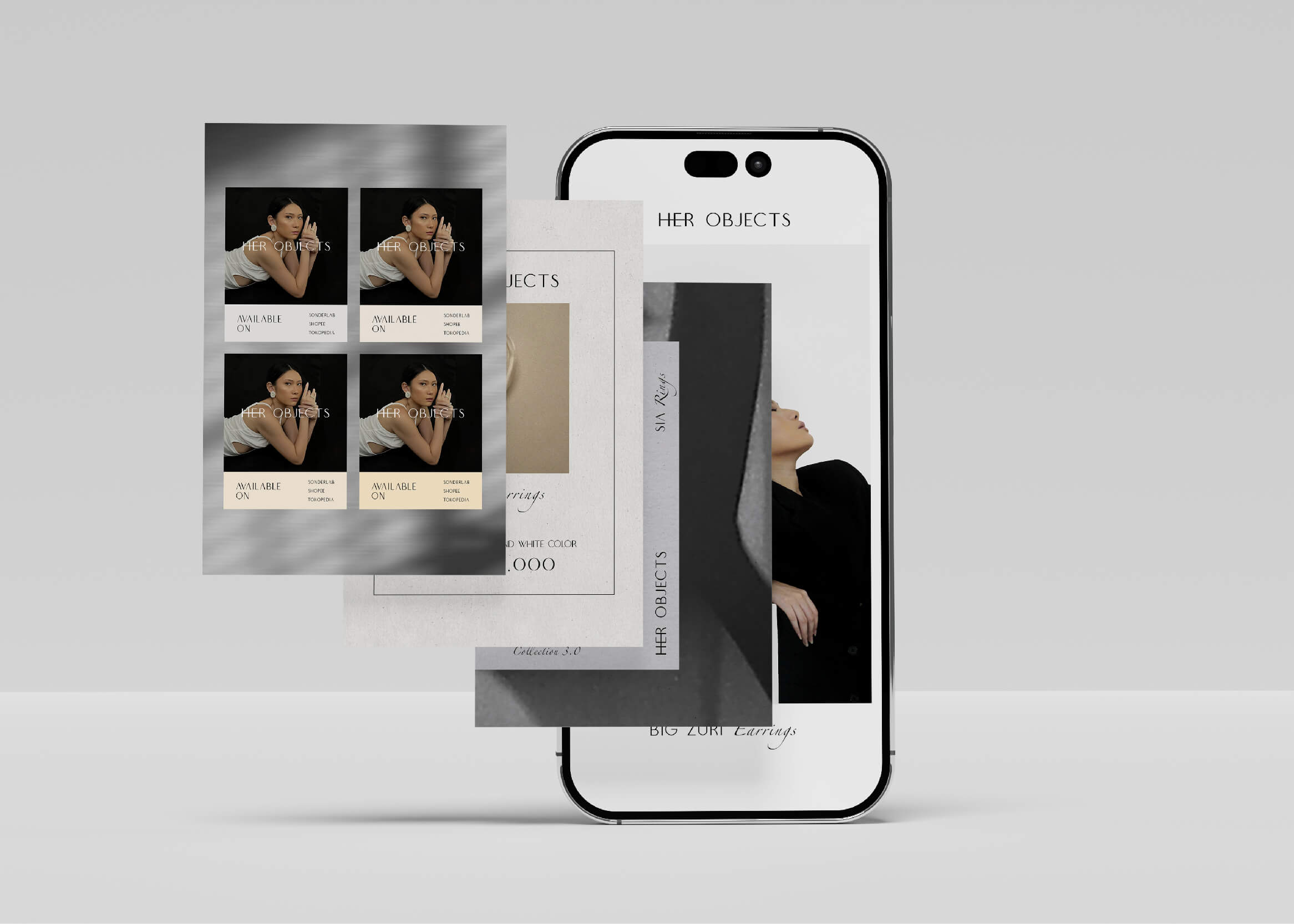
Branding • Photo & Video • Selected • Social Media • Work
The chosen typography style were Plantin MT Pro as primary font and Roboto for the secondary ones. The results awoke in various applications, such as social media and stationeries as the brand item. Apparently, Rainbow also chose the logo system that points attention to the letter “A” as a super-graphic element with the overall corporate-professional brand. The main logo also embarks the main business, “Interior Signage”.
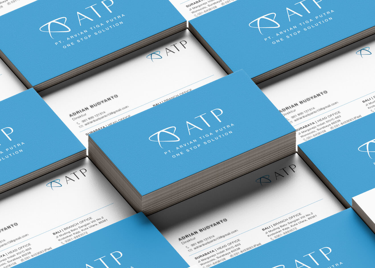
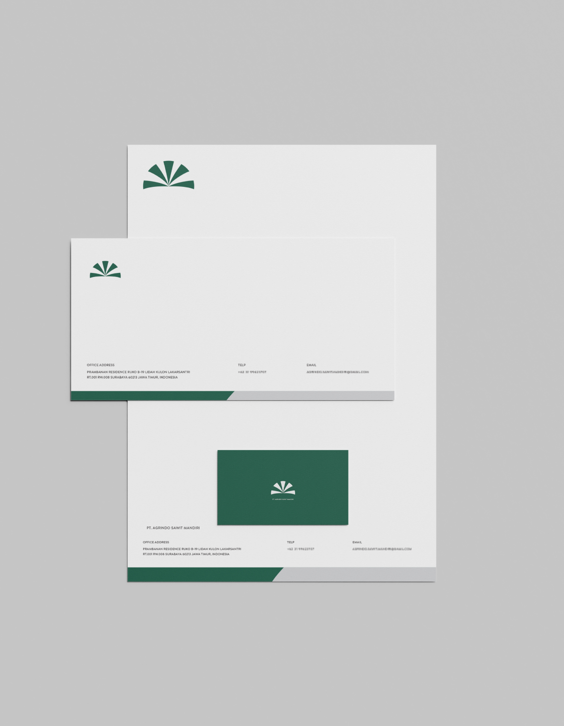
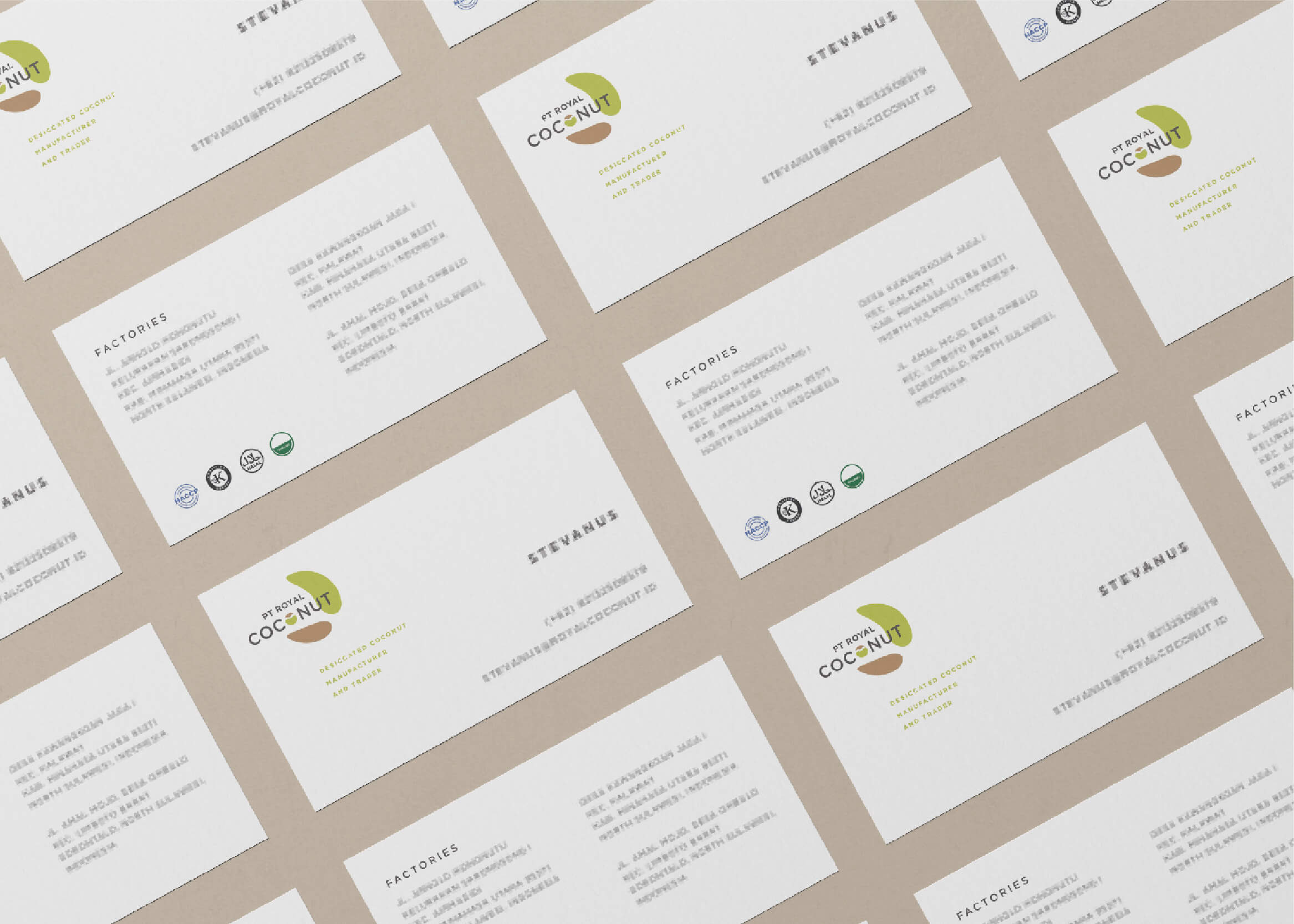
The various kinds of curated stationeries consist of business cards, invoices, and letterheads in a clean and professional style. The social media design also launches the A to Z of interior signage, including USPs about the company to helpful education. Some visual also obtained for social media graphic design to organic content usage.
Branding • Photo & Video • Selected • Social Media • Work
The chosen typography style were Plantin MT Pro as primary font and Roboto for the secondary ones. The results awoke in various applications, such as social media and stationeries as the brand item. Apparently, Rainbow also chose the logo system that points attention to the letter “A” as a super-graphic element with the overall corporate-professional brand. The main logo also embarks the main business, “Interior Signage”.
The various kinds of curated stationeries consist of business cards, invoices, and letterheads in a clean and professional style. The social media design also launches the A to Z of interior signage, including USPs about the company to helpful education. Some visual also obtained for social media graphic design to organic content usage.