Currently running from generation to generation, Arvian is locally known as the go-to baking store in Surabaya. A high quality food service distributor and food industry distributor. PT. Arvian Tiga Putra’s vision is to ultimately become Indonesia’s leading distribution company in food and beverage industry. This legacy is the initial reason of the rebranding project. PT. Arvian Tiga Putra wanted to be seen more than just a baking store. It is a company that serves B2B as food service distributor and supplier for notable F&B chains across Surabaya, Bali, and the other areas.
Logo • Brand Identity • Company Profile Deck • Website

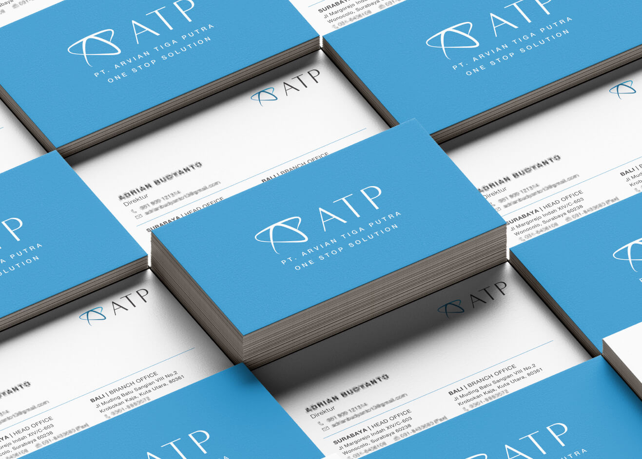
The concept was to look professional, sleek, and simple. The logo was designed with blue tone, minimal, and lasting look. A modern look but still maintains the credibility. The logo consists of the star that shows the stellar product and service from PT. Arvian Tiga Putra, but also the shape consists of the letter A T and P. Besides the company name, the tagline is also present in the full logo: “One Stop Solution”. Along with the logo system, a business card, invoice, calendar, website, company deck, and other stationeries are also designed with the application of the branding concept.
The company website wants to achieve a less rigid or corporate look. Thus the home page is shown with an illustration. The site is also mobile friendly with an interactive interface. Dominant in PT. Arvian Tiga Putra’s blue color that is attractive yet calming, and also pleasing to the eyes. The calendar was designed with food ingredients in mind, hence it has a photograph of aesthetically pleasing food on dining tables for each month.