Derived from the word pure, the name PURA is inspired by the purity of the product source.
Starting as a local brand pioneer for himalayan salt products, PURA expanded their choice of healthy products throughout the years. The main idea behind PURA is to be a clean, premium, healthy, and hygienic brand. Initially, there was no specific design direction, so the brand was built from scratch. However, the main goal is to provide better kitchen products for consumption in Indonesia. The target market that they strived for are young moms, as they are becoming more aware of healthy lifestyles. They are a pinnacle of advocates for better life, which starts with consumption.
PURA’s marketing positioning refers to the ability to influence consumer perception regarding product relevancy to competitors. No other local condiment brands in Indonesia focused on healthy lifestyle and consumption at that time. The majority of salt brands in Indonesia prioritize the economical factor, as they mostly are regular table salt products. One of PURA’s main competitors aren’t local brands, but imported brands as well. In conclusion, PURA wants to introduce a simple brand with a powerful message behind it.
“PURA is the pioneer of himalayan salt local brand in Indonesia, as their first main product was himalayan salt. A premium looking branding, which contrasts the current condiment design which rarely tackles on branding, certainly makes PURA more unique.”
Key Challenges
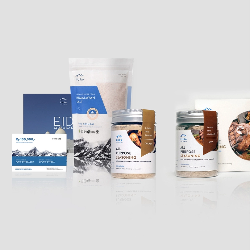
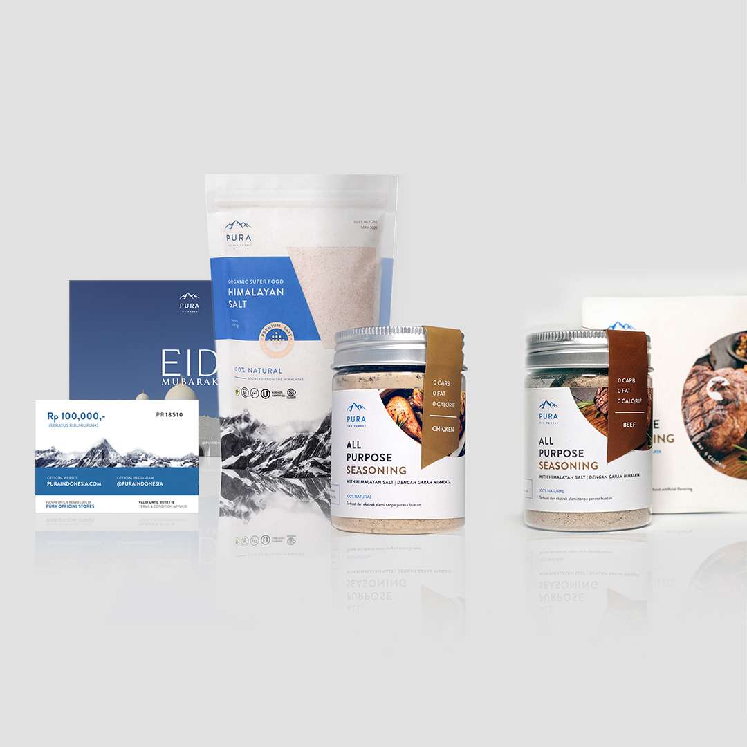
From that main focus, there is also a mission to break the stigma that salt, condiments, and other kitchen ingredients are plain, generic, and boring. As potential consumers stop and stare at PURA, they can see something new and fresh, with a design that captivates but also gains trust at first sight. The products have to be easily recognizable and also stand out on the display racks. On the other hand, the design should look as premium as imported brands, without looking too expensive and unattainable. That leads to one challenge: how will the design work? PURA’s main message is the high quality healthy lifestyle. It is not the regular kitchen salt, it is a healthy habit.
But, how?
The Solutions
What do people think of himalayan salt? A majority of them said these three words: premium, healthy, and pink. And with that, a blank canvas was ready to be painted. Those three words incorporated to strategize our way into curating the best branding that reflects PURA’s core values.
How to look premium without looking too expensive?
The short answer? An ambiguous blue (cool but also friendly and approachable) with a hint of warmth.
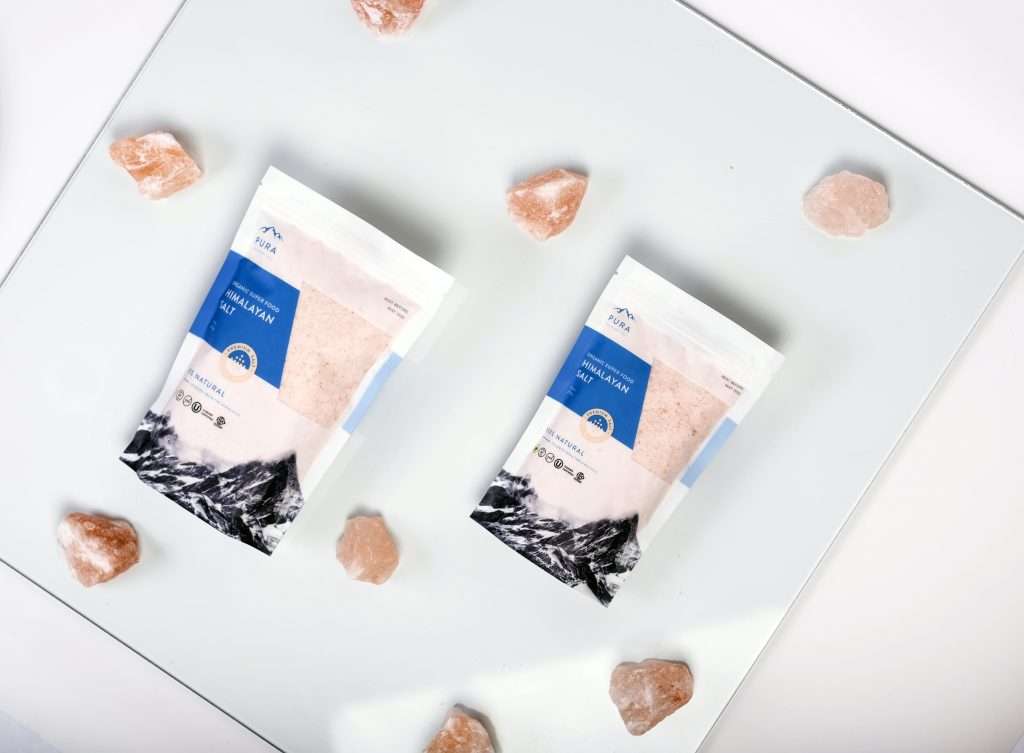
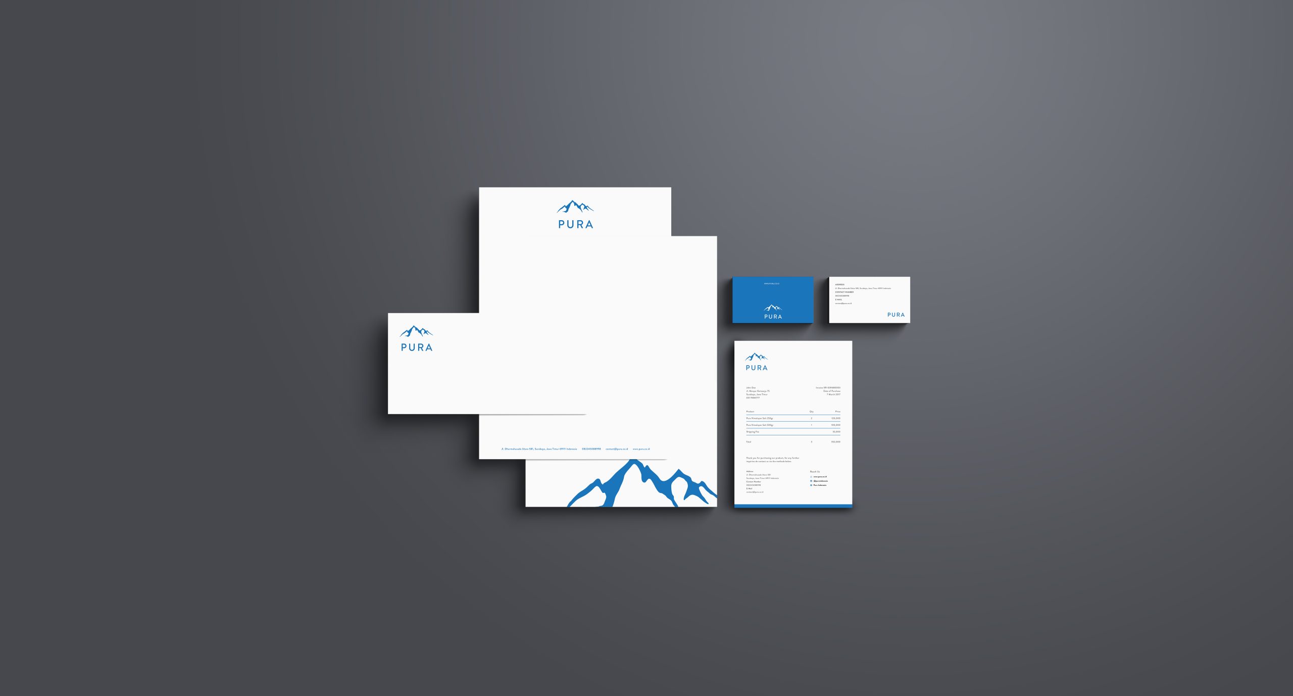
The blue we choose will act differently depending on how we use it. For the branding, the blue brings out the clean, premium, and trustworthy element from the brand, but at the same time it can be used in a playful and approachable element when used in the packaging and social media. While the packaging has more hints of colder colors (blue dominant) throughout the product lines, the images and certain graphic element eas out the coldness. The social media can be seen with warmer vibes that suit PURA’s target market. Besides blue, as the main target market are moms and young moms, the himalayan pink color was used as a color accent. Other color palettes are limited to shades from black, grey, to white. These three contrasting colors balance each other perfectly to find the balance Pura needed: a balance. A balance of premium yet approachable.
What We Learned From It
Function is key.
Looking good is essential, but function is the most important. The statement comes from overall elements that focus on value of function and construct PURA into the clean and trustworthy brand. The ambiguous blue and himalayan pink accent amplify each other to build a brand that is reliable in front of the target market. The appealing and functional packaging design also means to highlight the unboxing experience that impacts impromptu promotion across social media.
From the all-in deliverables through physical and visual production, PURA strives to create a strong branding through consistent value and brand message to help them grow further.
AKIKO wanted to create a brand refreshment from the ‘dupe’ image and create a stronger brand and stronger relationship with their audience through brand identity and awareness. That’s why brand applications needs to prioritized, such as photography, packaging design, print design, online presence as well as overall engagement.
Malta, a new local sandal brand that happens to be Swallow’s sister brand, is strategically positioning itself in Indonesia’s competitive footwear market intending to gain the trust and support of local consumers. The brand seeks to emphasize the importance of supporting Indonesian products over international products. By focusing on affordability, Malta has emerged as a leading footwear pioneer with distinctive brand characteristics.