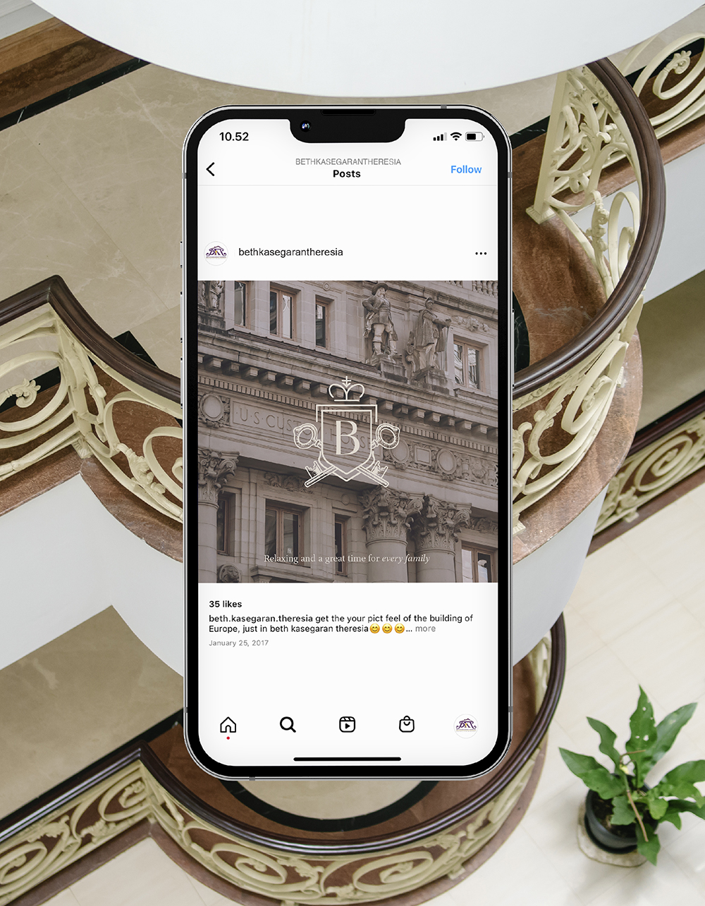
Beth Kasegaran Theresia is a serene staycation destination in the midst of Bogor. The goals we had were to rebrand the hotel to increase brand awareness, which eventually will lead to more sales. To gain more sales outer than the peak season only, BKT decided to rebrand for more longlasting and sustainable destination, specifically for the ones who need healing and detoxification activity.
Brand Identity • Menu • Voucher • Social Media

The logo redesign depicts Beth Kasegaran Theresia at face value: A grand hotel building. The illustration of the building is made with the actual Beth Kasegaran Theresia building in mind: Elegant, calming, simple, but rich with heritage. The rebranding went with choices of calm and relaxing vibes for the family. One of brand aspects identity was color application, earthy tone with no monotonous elements inside. Other interesting thing: The logo icon is inspired by the elegance and heritage of the hotel.
The shield imagery is chosen to decorate the letter ‘B‘ for ‘Beth‘. A shield, as in a guarded place, a safe space, with classic touches, and strong legacy. The key image also supports the ‘safe space’. Supported with some brand items, such as business card, envelope, and invoice that complete the branding application. The social media visual also highlight the dominance of purple color and organic photograph asset.