Is Surabaya-based laundry and dry cleaning service. As the new mentioned brand, Dry & Go had to presented the logo and branding identity to be known by the customers out there. So, here’s a few thing: Dry N Go logo design is inspired from the American Retro design style by using a Sans Serif typeface that designed to look attractive, fun, and approachable, while still maintaining a simple and clean impression.
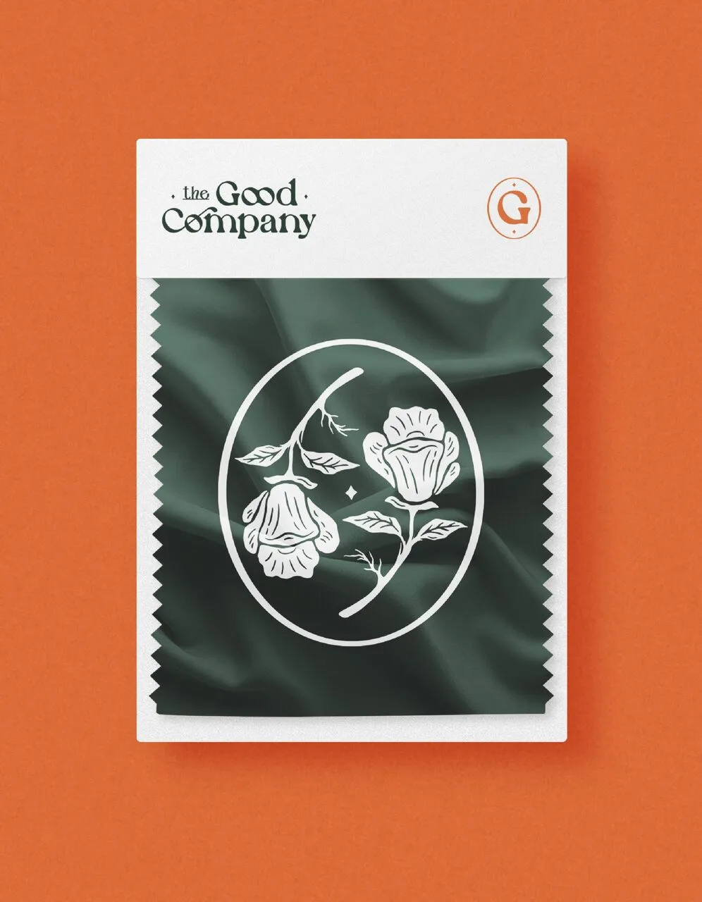
Logo • Brand Identity
Branding • Illustration • Work
The script typeface on the letter N emphasizes Retro impression that is calming and friendly to show the friendly service service from Dry N Go. On the G and O, a foot illustration with an iron is added to give meaning, “definitely dry and fast”. The shiny star element is also designed to symbolize the good quality of Dry N Go.
The brand items made were include point card, invoice, and flyer design. Some brand items mentioned also design with catchy blue as the brand color. Developed in handy and ideal size as printed materials, customers also helped to remember Dry & Go as one-stop laundry & dry cleaning service in the whole neighbourhood.